brand systembuilt to look
built to look
alive.
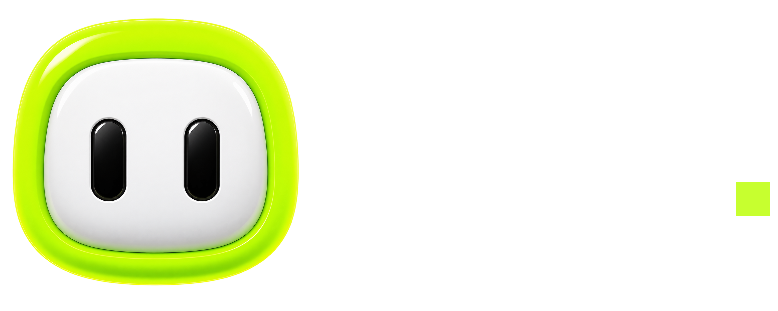
logo treatment, core colours and the visual principles used throughout - lime on ink, heavy display, one friendly mascot.
wen

electric lime#c8ff00
ink#030604
moss#0b1510
bone#f7faf5
high contrast
lime is an action and emphasis colour, not a full-page fill. let the ink do the heavy lifting.
playful, not noisy
bold display type and the mascot carry the energy - the rest stays calm and legible.
two faces, no more
clash display for the shout, aeonik for everything else. that’s the whole type system.
the cast
meet the mascot.
one character, every mood - the face of wen across the app, from a green candle to a red one.


